Welcome back to Wall Power. I’m Marion Maneker.
If you haven’t
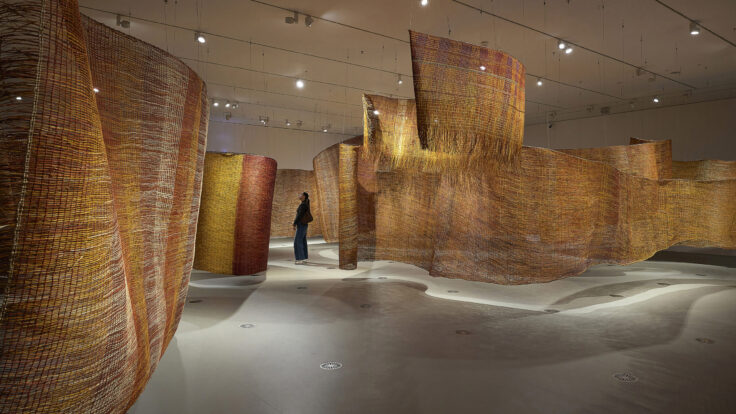
been to the new New Museum down on the Bowery, I really recommend seeing the opening show, New Humans. Any fan of architecture should go, just to see how OMA’s Shohei Shigematsu was able to reconceive the institution by adding an adjacent building. And you don’t have to be an architecture nerd to enjoy Dan Duray’s interview today with Shigematsu. They discuss what the Japanese architect learned from an unbuilt extension to the Whitney’s Breuer Building,
the need for space for public engagement, and how the new annex fits into the neighborhood.
Before you get there, I’m going to take you on a brief tour of the auction highlights from recent sales in Hong Kong and London. With global financial leaders like Christine Lagarde making increasingly ominous sounds, it may be surprising that art markets around the world are still perking up.
Also mentioned in this issue: Osman Hamdi Bey,
Johannes Goedaert, Marina Abramović, Ulay, Taryn Simon, Kanye West, Lisa Phillips, Kurokawa, Mark Rothko, Joan Mitchell, Sanyu, Zao Wou-Ki, Lucy Bull, Mai Trung Thu, Wu Guanzhong,
Paul Cézanne, and many more… |
|
|
|
Let’s ease into this gently… |
-
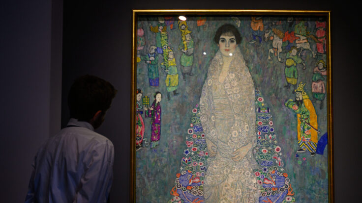
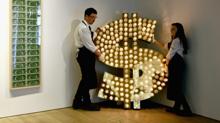
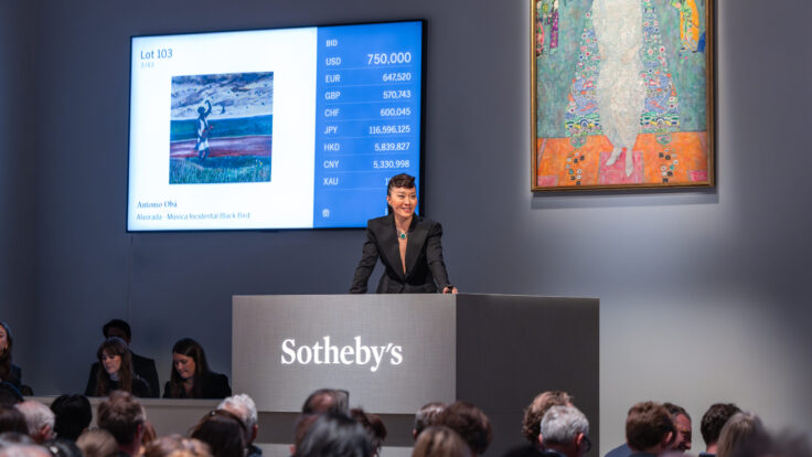
Sotheby’s solid night: Sotheby’s Hong Kong Modern & Contemporary Evening sale totaled some $70 million last night, a 60 percent improvement on the previous year’s sale. The top lot was a late Joan Mitchell, La Grande Vallée VII, which made $17.5
million—$3 million more than the same work sold for nearly six years ago. That should give the broader market some confidence, even if the consignor might have taken a slight haircut once fees are factored in.
A surprise hit of the sale was a 1949 transitional Mark Rothko painting, No. 10, which sold for $8.5 million, or about double the
estimate. There were also strong sales for Sanyu, Zao Wou-Ki, Lucy Bull, Mai Trung Thu, Wu Guanzhong, and Paul
Cézanne. - Christie’s rare Old Masters painting makes $1.3 million: Christie’s calculated move to offer Johannes Goedaert’s floral still life—one of only eight paintings by the artist that have survived to the present day—paid off on Friday, when the painting sold for $1.3 million in
Hong Kong. Christie’s had a third-party guarantee, but the final price was more than double the estimate level. That’s a good result for the work, for interest in Old Masters paintings, and for the Asian market.
- Bonhams sells Osman Hamdi Bey for $4.9 million: Meanwhile, in London, Bonhams sold Turkish artist Osman Hamdi Bey’s late 19th century image of Istanbul, titled At the Mosque Door, for nearly $4.9 million on
Wednesday. That’s a top-five auction price for the artist, whose record price was set in 2019 at $7.8 million, followed less than a month later by another $6 million auction price. Six of the top 10 prices at auction for this artist were achieved in the last seven years.
|
Now, have you met Mr. Shigematsu? |
|
|
|
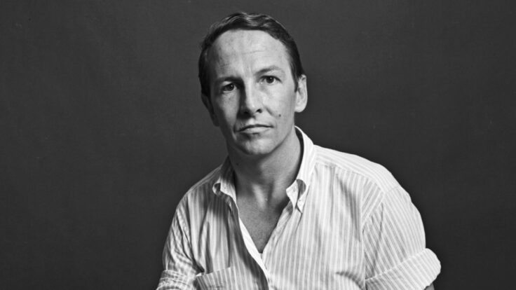
An enlightening conversation with Shohei Shigematsu, the architect behind the New
Museum’s sci-fi makeover, about the challenges of building in New York and what he learned from designing the Whitney extension that wasn’t. |
|
|
|
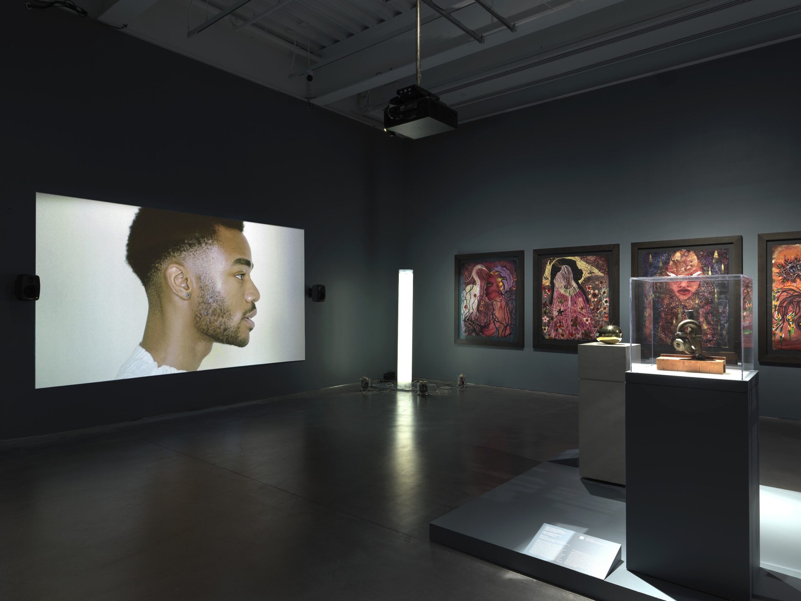
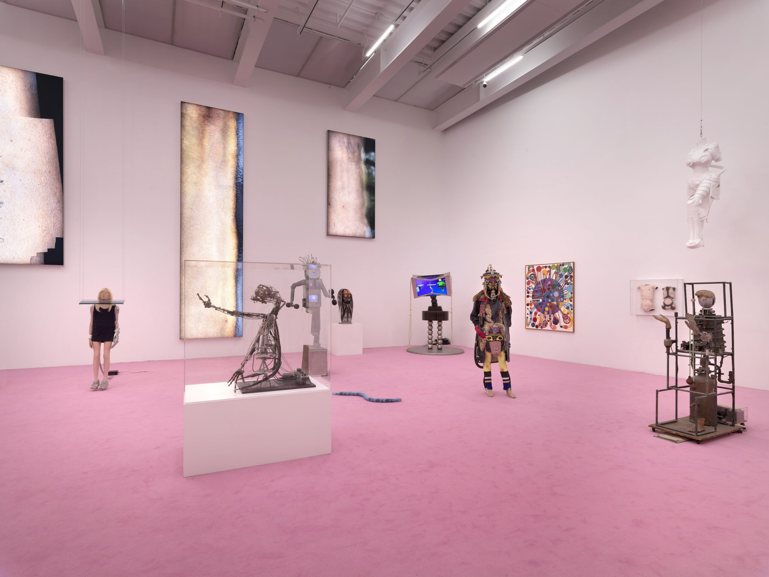
The excitement around the New Museum’s annex exceeded normal expectations for an architectural
face-lift. Earlier this month, the long-awaited extension finally opened, doubling the preexisting exhibition space to 120,000 square feet and addressing some of the original building’s well-known shortcomings—the museum was notoriously difficult for curators to program and not always pleasant for visitors to navigate. How did OMA, the architects tasked with reimagining the museum, solve those problems? I spoke with Shohei Shigematsu, a partner at the firm, to learn more about
the difficult task of building a functional, forward-facing museum for the 21st century. As usual, this conversation has been lightly edited for length and clarity. |
Dan Duray: This is OMA’s first public building in New York. What
does that mean to you?
Shohei Shigematsu: In 2001, I was the project architect on the Whitney extension. Our scheme was to preserve the brownstone and launch the building from the courtyard with this concrete structure. It got board approval from the Whitney, and also D.O.B. approval, but after 9/11 this high-rise museum started to become an unstable shape. So it got canceled. I’d worked on it for a couple of years. So, of course, it was
very shocking that it was canceled after approval.
Since then I’ve been trying to do something in New York. We’ve achieved commercial buildings, but a public building is something different. Again, the New Museum project is a museum extension—this time, contemporary architecture against contemporary architecture—but I think there’s some similarity to that situation. So yes, it means a lot to me, and also for the office. |
|
|
|
Did any ideas from that initial Whitney design carry
over?
Not really. But maybe one thing that reflected the Whitney effort was that we were more careful this time about how to interact with an existing building. We were aware of the trickiness of adding contemporary architecture to another contemporary architecture, because typically a museum extension happens over a 50- or 60-year span, so the previous architecture has a different style, right?
The contrast is easier here. Before we even
started designing, we started to look at the notion of a pair. Finding the right pair is one of the hardest things in contemporary life. We collected images. I’m looking now at Imponderabilia (1977), by Marina Abramović and Ulay, a man and a woman standing naked with a certain level of independence. A picture of a motorcycle with a sidecar that captured horizontality and verticality in perfect balance. Those things actually informed us to conceive
something that is independent but ambiguously related.
I think the carefulness maybe came from the fact that I thought we could’ve been even more careful about the Whitney extension at that time. It’s not like I’ve been thinking about the Whitney all the time, but if you think back, maybe that’s one of the lessons that was reflected in this effort.
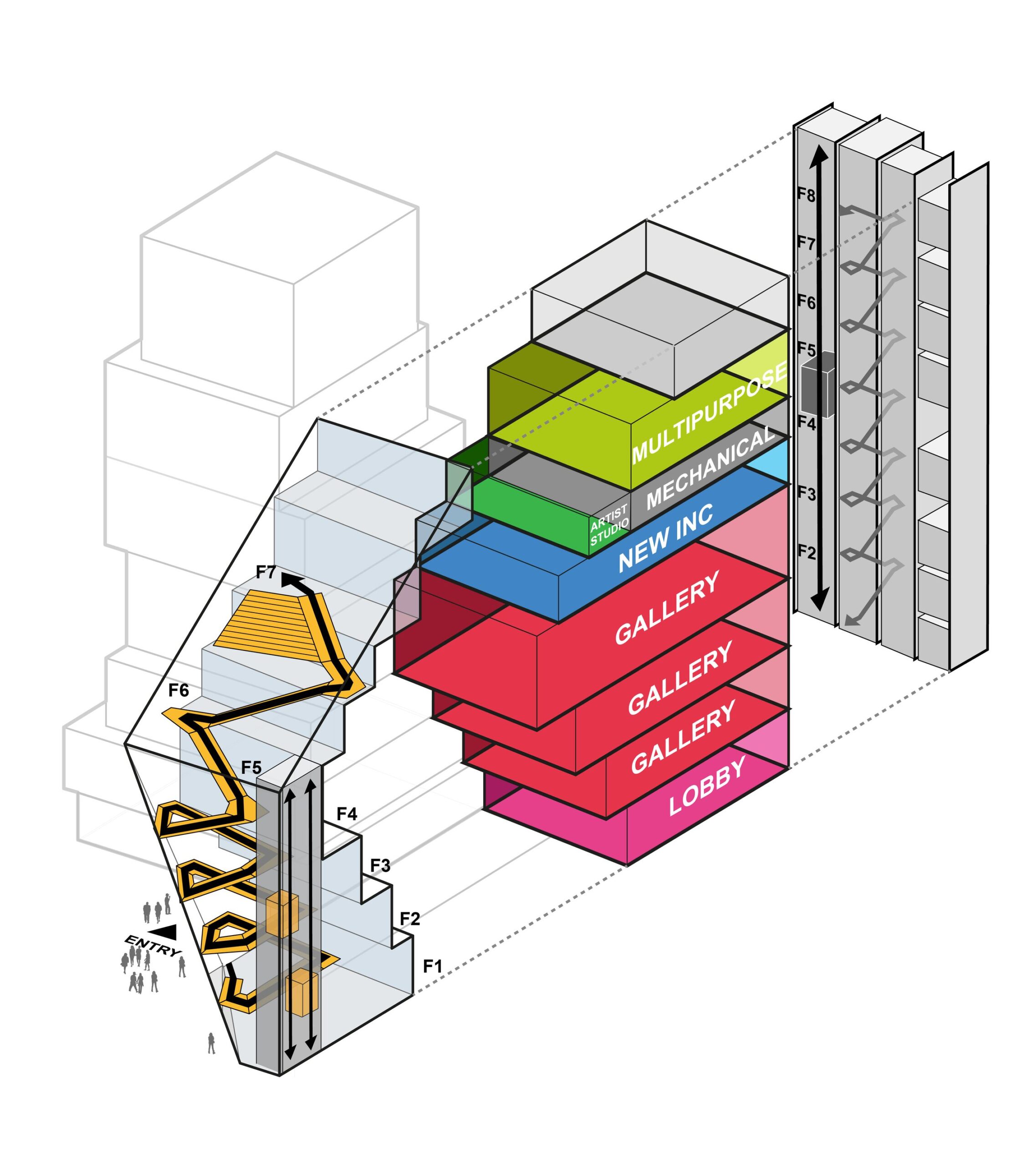
The expansion doubles the exhibition space. To what extent did the curatorial team weigh in on the
design?
Maybe that was one of the lessons learned through the Whitney. At that moment, maybe we were a little too focused on the architectural possibilities of the galleries, and not talking to the curators enough. Since then, I personally grew by doing many museum projects, but also a lot of artist collaborations—with Taryn Simon, with Kanye West. We did exhibition design, auction houses, fashion exhibitions. We
were touching on different roles surrounding the art field, and that deepened our understanding of curators’ needs from different directions. So our knowledge was probably much deeper than when we did the Whitney.
But also, yes, we talked to [New Museum artistic director] Massimiliano Gioni a lot. About how it could be connected, how it should work together with the existing building. Wall space is so precious that we discussed opening locations with him constantly. Now
they’re using both buildings for one big mega-show, but you can actually separate them and have two separate shows, or different shows on different floors using both buildings. The flexibility for
curation is much better. The combinations and possibilities are infinite.
The official text says the facade is meant to communicate the museum’s activities outward while drawing the public inward. How did you achieve that?
My theory is that museum extensions used to just ask for more gallery space to accommodate a growing collection. But what’s often missing is a brief that says you need space for community engagement, because it’s
very hard to quantify how much space you need for that, or what kind of space. I’m calling it open-ended space, where the museum more than ever needs places where people can improvise and do different activities that reflect the diversity of what the museum is actually doing. Since Lisa Phillips became the director, the museum had grown into not just an art entity but a multifaceted one.
They have this New Inc incubator, education events, IdeasCity. So the site was very
interesting, because it’s the dead terminus of Prince Street. Our idea was that the activity of the street continues going up, creating this public face. You have the spiral stair, which becomes an art space, two dedicated elevators moving up and down that are visible, and terraces above. It’s a contrast to the SANAA building, which has no sense of orientation once you’re inside. It’s a hermetic box. This stair atrium is a buffer zone between the city and the galleries, and it’s a domain for
art. And every landing has two doors. One that goes into the existing building, one that goes into the new. So it really serves both buildings, but also creates a sense of rotation, a sense of openness.
What we did was almost clone the same program, aligning every single level to the existing building, but we added extra circulation dedicated to the gallery, a
large stair at the back core, and a bigger freight elevator. It will probably be used like the Guggenheim, where people go up to the fourth floor and then take the stairs down, which reduces the load on the elevators. |
The building has a very sleek, almost sci-fi quality. How did you arrive at that
aesthetic?
We wanted transparency, but also some synergy with the existing building. We decided to use this Swiss product called Sefar. It’s a really fine metal mesh laminated into the glass unit. During the day it looks very solid and metallic, and the entire west facade is clad in the same material. But from inside, you see outside. And as it gets darker, you start to slowly expose the transparency and the anatomy of the building. So the pair
contrasts differently at different times of day. |
|
|
|
You might call it sleek, but for me it’s more sculptural, simple. Because this area is so busy,
together with the SANAA building, we wanted some level of calmness. The back side, facing the Lower East Side, is quite different. We used concrete tubes and plugged in the elevator, stair, mechanical units, and bathrooms, like a Metabolist aesthetic. As I’m from Japan, I was thinking of that 1960s and ’70s movement, Plug-In City. You might know Kisho Kurokawa’s Capsule Tower that was recently demolished. |
Photo: Jason O’Rear/Courtesy of New Museum |
How do you feel the building should fit into the
neighborhood?
We were seriously thinking about the gentrification issue. For half of the competition, we were exploring how to preserve that existing building. One option kept the facade at the front and built a new tower at the back. But ultimately, because of the site constraints, you can’t access the site from anywhere but the Bowery side. We talked to the contractor and quickly learned you’d have to cut the facade entirely out, store it
somewhere, build the whole thing, and then put it back. And they told us that rebuilding the floors was more expensive than just demolishing everything and building new. So we thought, if it’s such a fake preservation—just keeping a facade that was stored somewhere and pasting it to a completely new structure—we should be more honest and just make something completely new.
Our shape is a kind of wedge where, if you walk around, you actually can’t really see the building’s existence until
you are very close, because it’s hidden by taller buildings around. So in a way, quite modest. And opening up the plaza—of course it’s a private space, but still, contributing to the congestion of the area. There are multiple levels of responding to the gentrification issue.
I know the Whitney rents out its space a lot for events and fashion things. Was the New Museum hoping to do more of that, and was that a consideration in the
design?
Yes, and we had to address that at two points. One was the ground-level lobby. You might remember that the vestibule was half its size, and the ticket and coat check were too close to the entrance, so it was often clogged. A lot of people would tend to actually wait outside. So we made the vestibule much bigger. You can enter from both sides, and we moved the ticketing and coat check further in. That whole area is a ticket-free zone and
it’s flexible. But obviously the main point is the very top, where we made another education and multipurpose space next to the existing Sky Room. And then you have the multipurpose auditorium with a view. A big event can happen using all three spaces, or you can do one event in one and another event in the other. It will give them more opportunity.
The restaurant is an independently inserted box. During open hours, you enter from the lobby, but in the off-hours, you can enter from
Freeman Alley. We found a way to convince the Bowery Mission to give us some space, and the restaurant turns into more of a speakeasy mode after hours. You enter through the kitchen corridor. From outside it’s quite obscured. It’s cork with silver leaf. Inside, it’s much more earthy, in contrast to the industrial palette of the museum. It’s all cork, with plants and booths, and the bar’s backdrop is by a local Chinese artist. We didn’t want to make a typical museum restaurant. We wanted to
create something as if a Lower East Side bar had intruded into the museum. The owner is interested in staying open until 2 a.m., so this could be a final-destination, dive-bar kind of place. |
Thanks, Dan. This was really enlightening. I’ll be back on Tuesday.
Until then,
M
|
|
|
|
Puck founding partner Matt Belloni takes you inside the business of Hollywood, using exclusive reporting and insight
to explain the backstories on everything from Marvel movies to the streaming wars. |
|
|
|
Ace media reporter Dylan Byers brings readers into the C-suite as he chronicles the biggest stories in the industry:
the future of cable news in the streaming era, the transformation of legacy publishers, the tech giants remaking the market, and all the egos involved. |
|
|
|
Need help? Review our FAQ page or contact us for assistance. For brand partnerships, email ads@puck.news. You received this email because you
signed up to receive emails from Puck, or as part of your Puck account associated with {{customer.email}}. To stop receiving this newsletter and/or manage all your email preferences, click here. |
Puck is published by Heat Media LLC. 107 Greenwich St., New York, NY 10006 |
|
|
|
|


