|
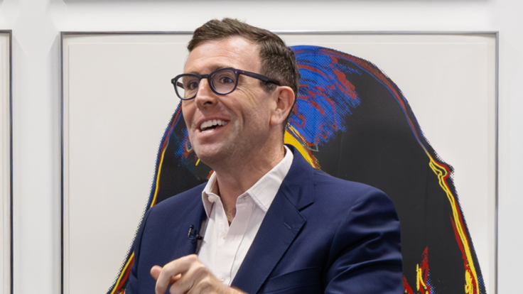
Hello, sports fans—and welcome back to Wall Power. I’m Marion Maneker.
Tonight, we’re talking about Olga de Amaral, the 93-year-old Colombian artist whose work defies categories. Or, I should put that another way: Long dismissed as a textile artist, de Amaral is now seen as the culmination or synthesis of many of the 20th century’s art movements. I’ll explain all of that in detail below the fold.
But first, here’s Julie…
|
|
|
 |
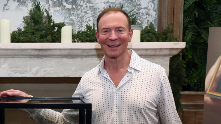
Julie Brener Davich |
|
The “Shape Language” of Torkwase Dyson
|
|
“Distinction,” Superfine: Tailoring Black Style, the Metropolitan Museum of Art. Photo: Courtesy of the Metropolitan Museum of Art
|
|
Superfine: Tailoring Black Style, which traces the arc of the Black dandy over the past 300 years, is a quieter show for the Met’s Costume Institute than has been on display in previous years—it’s all about fine tailoring, from top hats to zoot suits, interspersed with ephemera and paintings. Based on Monica Miller’s scholarly tome, Slaves to Fashion, it’s a fairly cerebral show—except, that is, for artist Torkwase Dyson’s awe-inspiring exhibition design itself. In the catalogue, she said her goal was to “recede behind the content.” In that, she has failed—the exhibition design, in many ways, defines and elevates the experience.
The Superfine galleries are black with occasional shades of gray, dramatic lighting, and angled pathways. The exhibition is divided into 12 groupings with names like “Cool” and “Presence.” One of the sections, “Distinction,” tells the story, through military dress, of Haiti as the first independent Black republic in the Western hemisphere. Dyson framed out the shape of a roofline for the mannequins to stand underneath, and designed boatlike shapes for them to stand atop.
Dyson, primarily a painter and sculptor, engages notions of architecture, geography, and Black migration. Her work has appeared in the 2024 Whitney Biennial, 2023 Desert X, and a solo show at the Serpentine in 2021. Much of the literature about her practice is impenetrably dense, given its deeply theoretical nature, which she calls “Black compositional thought.” (She got her M.F.A. at the Yale School of Art.)
She approached the Superfine exhibition design as a “shape language,” as she calls it in the catalogue. Instead of a rectangular vitrine, for example, she created an irregular trapezoid. Rather than deploying a straight line, she curved it. In her artistic practice, Dyson works with a series of “hyper shapes,” recognizable to anyone who has seen her past exhibitions at Pace and Richard Gray. For those who don’t want to brave the lines at the Met to experience Dyson’s work, the Public Art Fund has just unveiled Akua, a large open pavilion and immersive soundscape in Brooklyn Bridge Park, which will be up for the next year.
|
|
|
|
A MESSAGE FROM OUR SPONSOR
|
|
|
|
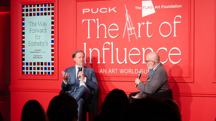
And now some May sales foreplay…
|
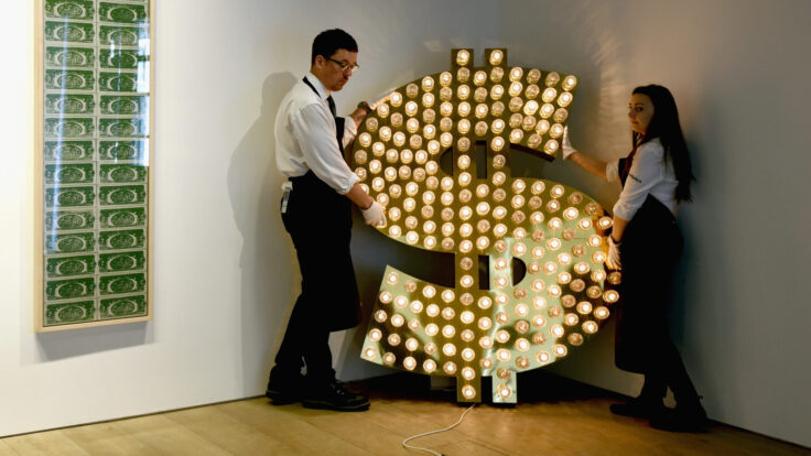
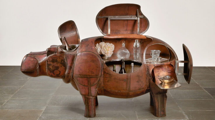
- The “living with art” pitch: It’s often striking how different a work of art can look in a collector’s home—sometimes tucked away in a remote spot, other times stacked salon-style on a stairway, or in a trophy spot in the living room. At the auction houses, the teams can take great care to show off the works in ways they think will appeal most to potential buyers. During some seasons, that means creating shrine-like chambers that make the art appear as if it were hovering weightless, illuminated by the most flattering and high-powered lights. The apogee of this trend was the 2001: A Space Odyssey–inspired display that Christie’s created for Jeff Koons’s $90 million Rabbit. At other times, the auction houses want to emphasize a more domestic setting for the art.This season, the theme is living with art, and we have multiple personal collections on offer. At Sotheby’s, Daniella Luxembourg’s works are displayed in a sitting-room setting that shows off her Alberto Burri, Nero Cretto, from 1976, to great effect. Barbara Gladstone’s suite of seven Raymond Pettibon works on paper are displayed over a credenza complete with ceramics and a stack of oversize art books. The suggestion is that we’re seeing a bit of Gladstone’s home here in the auction house. Over at Christie’s there’s a similar tableau: Jean Royère’s wing-backed armchairs are positioned in front of a small Calder, sitting delicately upon a Diego Giacometti table, at the center of a living-room-sized gallery lined with Warhol, Basquiat, and Picasso paintings.Indeed, the auction houses are pitching the value of owning art not as an asset, but as a lifestyle. Beyond the staging, there are some fun pairings. An executive at a rival auction house pointed me toward Phillips, which is juxtaposing a 1910 painting by Suzanne Valadon—she was a model for Renoir and Toulouse-Lautrec before becoming a painter herself—and a recent monoprint work on paper by Cecily Brown. These are two female artists, working a century apart, dealing with the subject of nudes in very different—but maybe not so very different—ways. The specialist(s) who came up with that match should buy themselves a drink.
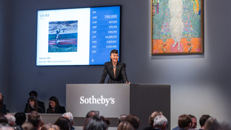
- A Basquiat boom: There are almost a dozen works by Jean-Michel Basquiat on offer next week, ranging from paintings like Baby Boom, which depicts the artist and his parents in a three-panel painting, from 1982 and estimated at $20 million; to an untitled color-saturated work on paper from 1981, estimated at $10 million. Walking through the previews last week, I was stopped by the early Basquiat collector Larry Warsh, who wanted to show me a drawing mounted in the middle of a highly trafficked wall of day sale offerings at Sotheby’s. The fine looping pen-and-ink image of a head, made in 1978 and giving heavy album-cover vibes, showed impressive draftsmanship from a delicate hand. Looking nothing like later well-known masterpieces Untitled (Head of Madman) or the Untitled (Head) on paper, or the $110 million work that Yusaku Maezawa bought in 2017, this work was estimated at $100,000 and turned out to be Basquiat’s earliest drawing of a head.
|
|
Now let’s get to the main event…
|
|
|
|
Textiles are having a moment as a valid art form. A new Olga de Amaral retrospective in Miami is a festival of technical skill that puts her fabrics, in the words of ICA Miami’s director, “somewhere between painting and sculpture.”
|
|
|
|
At Art Basel Paris last October, I ran into Bloomberg’s James Tarmy, one of the most sophisticated people I know. I asked what he had seen. “You have to see Olga de Amaral,” he blurted out—both as a recommendation and an assignment. His eyes opened wide, and he added, “Nothing even comes close.” The show of works from the 93-year-old Colombian textile artist, housed in a Jean Nouvel building in the 14th arrondissement—and open for a few more months, before it moves to a new home by the Louvre—was everything that Tarmy promised.
Late last week, ICA Miami opened its version of the de Amaral retrospective in collaboration with the Fondation Cartier, which had conceived and originated the Paris show. The exhibition focuses on her specifically, in contrast to last spring’s Weaving Abstraction in Ancient and Modern Art at the Met, which placed her work in dialogue with ancient examples of the fabrics made in the Andes over at least 2,000 years. That show also featured works by Lenore Tawney, Sheila Hicks, and Anni Albers, and emphasized the unexpected abstract traditions of Andean design and craftsmanship, not necessarily an understanding of de Amaral (or Tawney, Hicks, and Albers) as artists.
|
|
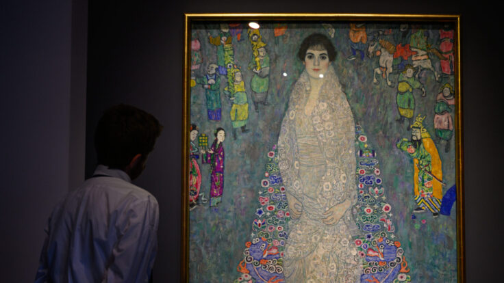
Olga de Amaral, Imagen Paisaje l (2006), estimated at $1 million, ICA Miami.
|
We’re living through a bit of a textiles-really-are-a-valid-medium-for-art moment; I’ve previously mentioned that Albers’s textile work got equal treatment alongside works by her husband, Josef Albers, as well as the couple’s former Bauhaus colleague, the Swiss artist Paul Klee, at a recent show at David Zwirner gallery. There’s also the MoMA’s Woven Histories: Textiles and Modern Abstraction, a show that brings Sonia Delaunay, Hannah Höch, and Sophie Taeuber-Arp into the story, along with Rosemarie Trockel and Andrea Zittel, among others.
|
|
|
|
A MESSAGE FROM OUR SPONSOR
|
|
|
|
But let’s not lose sight of de Amaral. “She bridges—historically and personally—Bauhaus, the American craft movement, Arte Povera, and geometric abstraction,” Alex Gartenfeld, the director of the ICA Miami, told me by phone when I mentioned how impressed I was with the Fondation Cartier show and de Amaral’s revitalization of mid-20th century abstraction. Gartenfeld marveled at the technical skills—not just weaving, but sewing, and a range of ingenious engineering solutions—displayed in de Amaral’s work, and casually remarked that the artist makes no effort to hide the high level of craft. “She takes the work off the wall and presents it somewhere between painting and sculpture,” he told me.
|
|
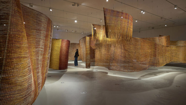
The Fondation Cartier show was divided into three distinct galleries, consisting of two triple-height glass cubes and a subterranean chamber darkened for dramatic effect. One room featured enormous wall works created in the 1970s. Using a horsehair and woolen armature, de Amaral layered multicolored squares made of a variety of materials, including paint, linen, cotton, gesso, gold leaf, and palladium. This ingenuity is on large-scale display in works that were originally commissioned for public projects, such as El gran muro, from 1976, first installed in an extended form at the Westin Peachtree Plaza Hotel in Atlanta; and Coraza en morados, from 1977, made for Miami International Airport.
In the second and most arresting room (at least to me) at the Fondation Cartier, we saw de Amaral’s Brumas, which she made during a five-year period in her eighties. These wedge-shaped works consist of dangling cords made from linen, gesso, Japanese paper, and other materials. They hang in a grid pattern and are colored in such a way that abstract forms and hues are suspended within the wedges. (When I first saw them, I couldn’t tell whether the colors were in the cords or being projected from lights.) If you’ve ever seen the lenticular chromatic works of Venezuelan artist Carlos Cruz-Diez, or the hanging works of Julio Le Parc, you might get some vague notion of what de Amaral is up to here. I had a moment of Stendhal syndrome standing beneath them.
|
|
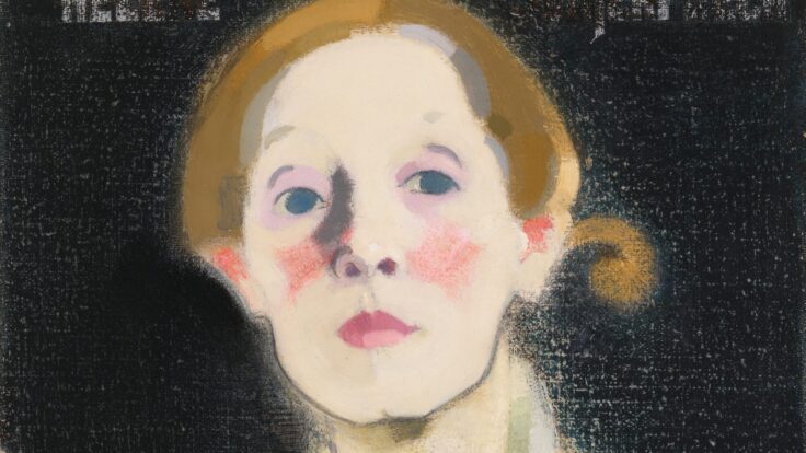
Olga de Amaral, Bruma D1 (Mist D1), (2018). Photo: Courtesy of Sotheby’s
|
|
In the basement at the Fondation Cartier, I saw many gold-toned and blue-hued takes on abstraction, where the texture of the materials and the vibrant hues—not to mention the complex two-sided works—put de Amaral in the same league as any of the abstract or even minimalist painters of the past century. Alas, you won’t see this arrangement, or even all of the same works, at the ICA Miami. Lina Ghotmeh, who created the Paris exhibition design, has restructured the show to suit Miami’s single open-plan floor. Drawing on the third-floor gallery’s view of the tree line outside, Ghotmeh has tried to extend the idea indoors into a spiral motif that evokes a vertical forest, allowing the works “to grow organically within the gallery.” At least, that’s what the press release tells me.
|
|
|
Most of us are not going to make it to Miami in the off-season, but if you’re in New York right now, you can see four of de Amaral’s works at the auction houses. The press tends to overstate the effect of museum retrospectives on artists’ markets. In de Amaral’s case, her work had previously reached prices of just above $500,000; anticipation of the Paris show may have helped move that price to nearly $700,000 last May, when Sotheby’s sold a 2013 gold work titled Pueblo X. This season, Sotheby’s is back with Imagen Paisaje I, estimated at $900,000 and guaranteed by the auction house. Christie’s and Phillips each have works estimated around $300,000, for those who are interested in acquiring the artist but don’t want to set a new record price for her work.
|
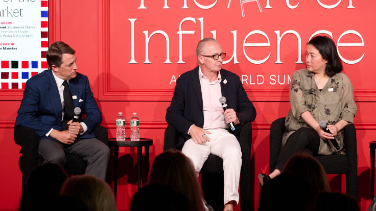
I will be moderating a panel at the Independent art fair held at Spring Studios this Friday. Come by if you want to say hello. Puck readers can get tickets for 20 percent off here (just use the discount code PUCK). If you want to learn more about the fair, you can start with this Financial Times story about the fair’s founder, Elizabeth Dee, and all of the artists who first debuted there.
The fair has produced some interesting data that you can read in more depth here. Some of the headlines: There will be 807 works of art by 140 artists, presented by 85 exhibitors. Almost three-quarters of the works at the fair were made to be shown at the fair. And the same proportion of the works are priced below $20,000. The number of solo presentations is up
more than 30 percent from last year. Two-thirds of the galleries come from outside of New York, almost half from outside of the U.S.
The rise of buying activity in the lower register of pricing has been a multiyear trend. No one really knows what’s driving it—we all have our suspicions—but it occurred to me the other day that we might have an answer right in front of us. I wrote something more than a decade ago arguing that the art market is where the food industry was 30 years ago: There were great restaurants in the United States in the 1980s, but culinary excellence had only an elite following. By the time the essay was written, food had become a popular art form: Waiters regularly gave the provenance of ingredients when pitching the menu to customers, food trucks selling any manner of exotic cuisines were prowling major cities, and the culinary arts had become the subject of reality-television competitions.
My gut instinct (see what I did there) was that art would follow the same path, with more everyday folks developing an interest in art and collectibles and having conversations around art and artists. I don’t have hard evidence to back this up, but I think it has come to pass. There is one development, though, that I didn’t expect: As food culture has become more prevalent and varied, the old temples of gastronomy seem to have lost their prestige. Don’t get me wrong, there’s no shortage of expensive restaurants in America, but dining has changed almost irrevocably—and possibly at the expense of the fanciest French-trained, impeccable-service restaurants. The most expensive restaurants are now more relaxed, welcoming, and user-friendly. That may be the fate of the most important art, too. Let’s hope so, at least, even if that means it becomes less expensive.
If you’re a member of the Inner Circle—and, really, why wouldn’t you be (let’s fix that with an upgrade here)—I’ll see you tomorrow.
Yours,
M
|
|
|
Need help? Review our FAQ page or contact us for assistance. For brand partnerships, email ads@puck.news.
You received this email because you signed up to receive emails from Puck, or as part of your Puck account associated with . To stop receiving this newsletter and/or manage all your email preferences, click here.
|
|
Puck is published by Heat Media LLC. 107 Greenwich St, New York, NY 10006
|
|
|
|


,")


, (2018).")