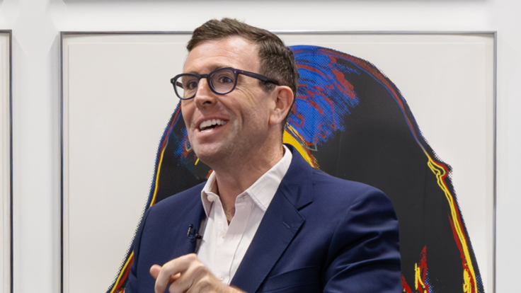
Welcome back to Wall Power. I’m Marion Maneker.
I’m having a
Sunday. I did a little home maintenance, got out on the water for some early-spring sailing, and I’m reading a good book. I hope your weekend has been as restful. And I’ve been able to enjoy the day because Dan Duray is here interviewing Jonas Wood about his new body of work, which debuted last weekend at Gagosian in Los Angeles for the gallery’s
traditional Oscars show. Before we get to that, I noticed an interesting lot in the Hong Kong sales. Plus, I have a brief preview of the South Asian modern and contemporary sales in New York, which can be some of the most exciting auctions around these days.
As always, if you’re reading but not a subscriber, stop being a scofflaw and get your own subscription here. Better yet, if you’re in the art
business, you really want to join the Inner Circle here. And, if you’ve got something you think I should know or just want to chat, you can always respond to this newsletter or reach me on SMS or WhatsApp at +1.917.825.1391.
Mentioned in this issue: Johannes Goedaert, M.F. Husain, Tyeb Mehta, S.H. Raza, Jehangir
Sabavala, Ganesh Pyne, F.N. Souza, Akbar Padamsee, Jagdish Swaminathan, Ram Kumar, Roy Lichtenstein, Georges Seurat, Henri Matisse, Ed Ruscha, and more… |
|
|
|
A MESSAGE FROM OUR SPONSOR |
|
|
|
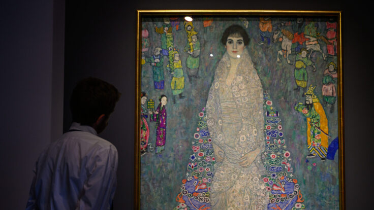
- Old Masters, new markets: Christie’s is reprising its Leonardo Salvator Mundi strategy in Hong Kong this week, when the evening sale of 20th and 21st century art will also offer a 17th century Dutch still life of flowers painted by Johannes Goedaert. While nowhere near as valuable as the Leonardo,
which was estimated at $100 million before selling for $450 million, the Goedaert is guaranteed and backed by a third party and estimated at HKD3.5 million, or $450,000. It’s noteworthy that Christie’s is generating interest in Old Masters paintings by including one in a prominent sale in Asia—but it’s also fascinating that the work they’ve chosen is quite rare.
Goedaert, a painter and naturalist, is not well known, even to Old Masters collectors. Only 16 of his works have survived. Eight
are landscape drawings, and eight are paintings—five landscapes and three floral still lifes. Narrowing the extant works even further is the fact that only four of Goedaert’s works—three paintings and one drawing—remain in private hands. How’s that for rare? But rarity can work both ways in markets. Sometimes it makes a thing quite valuable, other times it limits the appeal. With this auction, Christie’s is trying to attract a broader base of buyers, and also telling us they’ve had luck enticing
Asian buyers into the Old Masters market. Now we’ll see if they can bring more into the fold—or even have another unexpected runaway success like the Leonardo. - Back in New York, the South Asian art sales are upon us: One of the overall bright spots in the global art market these last two years has been South Asian modern and contemporary art. You may
remember a record was set for a work by M.F. Husain at Christie’s a year ago when someone paid $13.8 million for Untitled (Gram Yatra), from 1954, which had been hidden in a Norwegian hospital for most of its existence. In this year’s sale, Christie’s has a Tyeb Mehta painting,
Gesture, from 1977, with a $2 million estimate. There are also works by Husain, S.H. Raza, Jehangir Sabavala, Ganesh Pyne, and others. Over at Sotheby’s, the top
lot is a Husain estimated at $2.8 million, which is being offered alongside works by Sabavala, F.N. Souza, Akbar Padamsee, Jagdish Swaminathan, and Ram Kumar. These sales can have unpredictable results. I’ll be watching and expect to have more to say about them later in the week.
|
Now, let’s get to Jonas and his tennis courts… |
|
|
|
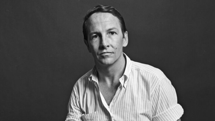
The L.A.-based painter who memorably captured the art of basketball has turned
his attention to the bold colors and contrasts of tennis courts. Here, he explains his lifelong love of Lichtenstein (“the GOAT”) and the importance of painting what matters—which in his case includes the ATP. |
|
|
|
Gagosian gallery always stages a major exhibition in Los Angeles over Oscar weekend, and this year
was no exception. Last weekend, at the gallery’s Beverly Hills outpost, Jonas Wood debuted a new body of work, a series of paintings of tennis courts. It didn’t hurt that the opening coincided with the very chic Indian Wells tournament, out in the desert. But the fact that an artist primarily known as a master of interiors had begun to paint tennis courts was a big
deal, itself.
Produced last year and in recent months, each painting represents a different court from matches held at Association of Tennis Professionals (ATP), Women’s Tennis Association (WTA), or Olympic tournaments. There’s also a court from the original Nintendo tennis game—because why not include a video game version when the courts are all so abstracted anyway? I recently caught up with Wood over Zoom as he hopped around his Los Angeles studio, moving the iPad to different
completed paintings to demonstrate elements he was describing, then putting it down to mix paint as he mulled over the more serious questions. As always, this interview has been lightly edited for length and clarity. |
Dan Duray: I feel like I’m talking to the mayor of Los Angeles
right now, so I have to ask first: How was Frieze L.A. for you?
Jonas Wood: Wow. Being the mayor of L.A. would be really fucking… tough right now, I have to say. But Frieze was chill. It was a good vibe. It didn’t rain. It seems like people were psyched to be here. I’ve been here for 23 years and people always ask me what’s changed about Los Angeles. I think the difference is that people want to come here and show their best art
here. Twenty years ago, people would say, “Save all your best art to show in New York City. It’s not worth it to show in L.A. because nobody’s paying attention.” Today it’s very different.
I think people may be more familiar with your work around basketball than tennis, but I’m curious about what first brought you to sports as a subject in general.
I just wanted to paint stuff that was around me and that I was interested in, and I
got kind of bored of painting my family or my friends or myself. I needed a different figurative source to practice painting. I paint in all these typographies—still life, portraiture, interior, landscape, patterns—so that’s how it kind of started. That combined with photographs—collecting photographs, taking pictures of things. So I was just thinking about what I was already interested in growing up on the East Coast, and being really into sports, and then starting to watch sports in the
studio, because I always have something else going on in the background when I’m working. But at first it was just to practice painting figures. |
|
|
|
A MESSAGE FROM OUR SPONSOR |
|
|
|
So you’re in the studio and you notice the tennis courts on your
television?
Eight or nine years ago, I had this idea to paint all of the courts at all the different tour stops on the ATP and the WTA, or just take a look at them, because there were all these colors to investigate. Truthfully, the interest in tennis courts comes down to just color theory. I’m really into color and pushing its boundaries, especially when it’s very bold. So, reinvestigating it, I had this idea to start collecting these photos,
watching the matches, and making these obsessed collages.
A lot of times, the background was still black, and then sometimes these photographs were peeking out behind the TV, so the back of my studio is in the painting. And in some cases, it was already interesting without me doing anything. In Porsche Tennis Grand Prix [2025], the court actually has those three pictures of Porsches that sit right above the playing surface, so that’s just an appropriation. I didn’t actually do
anything to that one. |
Jonas Wood, Porsche Tennis Grand Prix (2025). Photo: Marten Elder/Courtesy of
Gagosian |
The more obvious intervention would be the ones where I have the work of Roy
Lichtenstein behind the television, or patterns that are forced behind the television screen and not really in the studio. That was just me playing, pushing this color field idea further. Tennis is a vehicle that holds a fun place in my painting practice. It’s about color, color pattern, and forcing them into a space together.
Has your curiosity led you to research why the famous courts are the colors that they are?
Some
of them are because of the materials—the grass is obviously grass, and there are a couple different color clays—but others are a choice by each tournament. In the last three years, I got the Tennis Channel and started watching way more religiously.
Contrast is how I organize and make stuff. It’s a little bit like a cook with a recipe or a scientist with an experiment. Like, “Can I put a Lichtenstein in the background of a tennis court? Because I’ve run out of other interesting things to
do.” These paintings are all about Pop to me, things being symbolized by shape and color, with very little information. Lichtenstein usually has three, four, sometimes five colors. And it’s just circles and outlines. Or shapes, and dots. There are many similarities that I was thinking about and had never really explored in painting. These works are about tennis, I guess, but for me, they’re a vehicle to practice pushing things forward. |
Why Lichtenstein?
They kind of just
ended up there on their own. There are about 60 tour stops, and I was really just selfishly looking for ways that each court could look different from the next one. So even if it was a similar color, it would say Shanghai, or it would say Montreal, or the logos would be different, or the angle of the picture I took could make it unique. Then 80 percent of the way through the tour, I would run out. I had found patterns that were cool for the background—I wanted to do compressed wood instead of
regular wood grain, and then the one that’s rubber, that’s my gym floor. That was an early one and it meant the background was just dots. The way I paint is kind of in between Georges Seurat and Lichtenstein, where there are dots, but there are also lines, and there’s some rendering.
I’m just obsessed with Lichtenstein. I live with a Lichtenstein brushstroke print. It’s never appeared in my work, though the work of other artists has—if an artist’s work is hanging on the
wall of my studio, or my friend’s art in their studio, or there’s an Henri Matisse that I’m interested in putting on the side of a pot. It’s more about the idea that you can put anything into your painting if you want to, if you’re curious enough. Can it be this orchid that’s not really behind my TV? Or a landscape that’s not really behind my TV, but a picture I took in Griffith Park? |
|
|
|
I was already inserting whatever I liked into there, so the gateway was open. So I mocked up the
first Lichtenstein ones. I have a designer who works with me to organize my collages after I do them. We set it up, and he was like, “You’re really gonna do that, huh?” And I was like, “I guess I really am.” I was the least surprised. Here’s something else that I don’t own, that’s not mine, but I’m interested in…
That’s already appropriated…
I think it’s more about asking a question. If I have an idea, and then I make a collage of
it, then a drawing, and then I make a painting of it, I’m asking myself a series of questions. “Can I put a Lichtenstein behind the tennis court concept?” Yes, you can. Or, “Oh shit, I don’t know if it’s gonna work. Let’s see this all the way through. Okay, it makes sense. These things are jibing.”
But it’s still very abstract. That’s the thing about all my paintings—I’m not a photorealist. I was never gonna re-create things to be real, but Lichtenstein’s already not real, so then when
re-creating it and reintroducing it with your own work, there’s a different kind of kinship with this artist. I care about this artist. This artist is important to me.
I grew up with these three posters in my room of this Lichtenstein work. My parents had printed it out on foam core, one work across three posters. I screwed it into the wall with screws. It’s just intuitive, and it’s not meant to offend. I’m honoring the GOAT. |
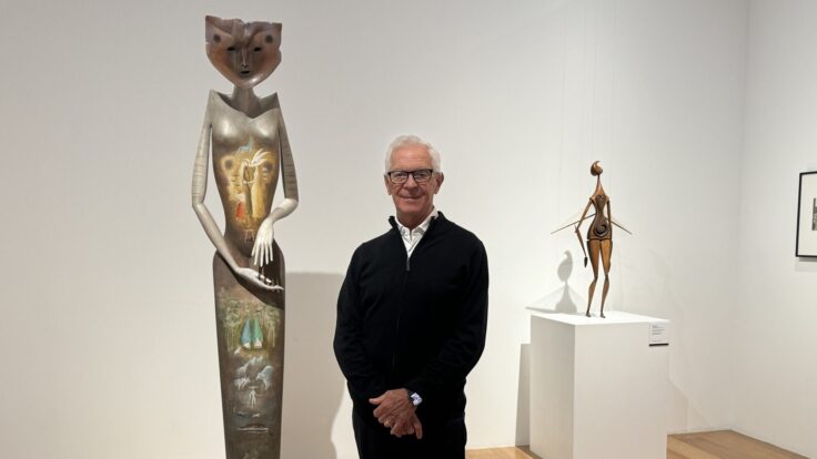
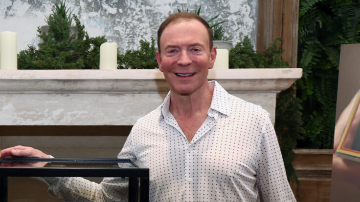
Jonas Wood at Gagosian Gallery, Los Angeles. Photo: Jeff McLane/Courtesy of Gagosian
|
You’ve spoken a lot about your influences here, and you’ve also mentioned Henri
Matisse.
I appropriated a bunch of Matisse’s red paintings, and investigated their creation. That’s not necessarily the way I paint, but [it’s] the idea of a practice where you make paintings about your life, and you orchestrate things to be set up around you so that’s what’s best for you to paint. It just seemed like he was really into the things that he painted. And I always felt that way in school. I thought it was really important that the
things that you were making were truly meaningful to you. Because it’s hard to make a giant painting. You don’t want to be halfway through it and be like, “Wait, I don’t care about this.” So I think I just wanted to make sure I cared about it.
You owe more to their philosophy than even to their aesthetics, it’s sounding like.
Yeah, but I also think Ed Ruscha is a great model for a practice. To care deeply about
something across time, and be able to constantly reinvent it, but still be touching on the same interests. Mine are divided into the typographies of all the different parts of figuration that you could touch upon. The one of the French Open, French Open with Wood Grain (2025), I would consider a very important painting, because it does have everything in it. It has a still life, it has a portrait, it has a little bit of a landscape because there are windows, it has a
pattern. It doesn’t have a figure, but it does have a little picture of a figure pinned onto the wall behind the TV.
These tennis courts are a one-of-a-kind typography of painting, but they fall under a different kind of category. A tennis court isn’t really a place or a person, it’s something else.
Did you ever play tennis?
My tennis career was hot and heavy for about five years. I got really into it in 9th grade. I’d play
all summer after work; I’d go play with my friends until it got dark. I was pretty decent. I tried to play in college for one year at Hobart, and it was, unfortunately, “real” sports. I never really worked out or ran or anything. I just played sports—basketball, soccer, and tennis all through high school. I stopped playing tennis freshman year, and then I separated my shoulder senior year and completely stopped playing tennis. I had surgery 10 years ago, got it all cleaned up, but it was already
my painting shoulder, so I’m not even gonna try to play too much tennis. I’ll hit once in a while. Now I just watch. |
Thanks, Dan. This was great. I’ll be back on Tuesday with more about the developing spring art
season.
Join me then,
M |
|
|
|
Puck founding partner Matt Belloni takes you inside the business of Hollywood, using exclusive reporting and insight
to explain the backstories on everything from Marvel movies to the streaming wars. |
|
|
|
Ace media reporter Dylan Byers brings readers into the C-suite as he chronicles the biggest stories in the industry:
the future of cable news in the streaming era, the transformation of legacy publishers, the tech giants remaking the market, and all the egos involved. |
|
|
|
Need help? Review our
FAQ page or contact us for assistance. For brand partnerships, email ads@puck.news.
You received this email because you signed up to receive emails from Puck, or as part of your Puck account associated with {{customer.email}}. To stop receiving this newsletter and/or manage all your email preferences, click here. |
Puck is published by Heat Media LLC. 107 Greenwich St., New York, NY 10006 |
|
|
|
|


. Photo: Marten Elder/Courtesy of Gagosian")